Dragging Rectangles
Since the introduction of the Mac, and the Adobe-Quark-DTP worldview that followed, computer-based design tooling has largely revolved around dragging rectangles.
Want to insert a photo? Drag a rectangle. Want to change the width of your columns or gutters? Drag a bunch of rectangles. Want to take a screen designed for UIKit and see what it would look like on Android with Material Design? Drag a whole lot of rectangles
And yet I see nothing to tie the role of designer to rectangle-dragger. A designer is a manipulator of symbolic and aesthetic concepts, and that needn’t be limited to the input paradigms we’ve grown up with.
We’ve been empowered to build exciting new tooling in a large way by the React paradigm. It’s easy to spin up a new design tool that maps some niche input domain to a tree of React elements, and render it to screen. It’s a trick we used with react-sketchapp — when you know the name of a thing, you can instantiate the thing at will. This is something that was radically more complicated only a few short years ago.
As we explore non-mouse-based design tooling at Airbnb, I thought I’d lead with an example.
“You're a product designer, what tools do you use?" — Markdown Files. Many... Markdown files. — @miekd ↗(opens in new tab)
Dutch design-philosopher Maykel Loomans observed that as designers mature into leadership roles, we move from pixel-based tooling to writing documents. Quip documents and Google Docs and Markdown files; slide-decks and meeting agendas and PRDs and specifications.
Of course these tools lack the ability to visualize what you’re specifying—writing tools end up with reading as the end interaction—but what if you could just describe the interface you wanted? We've had language for thousands of years, and can surely express design intent clearer with our words than with a mouse or stylus.
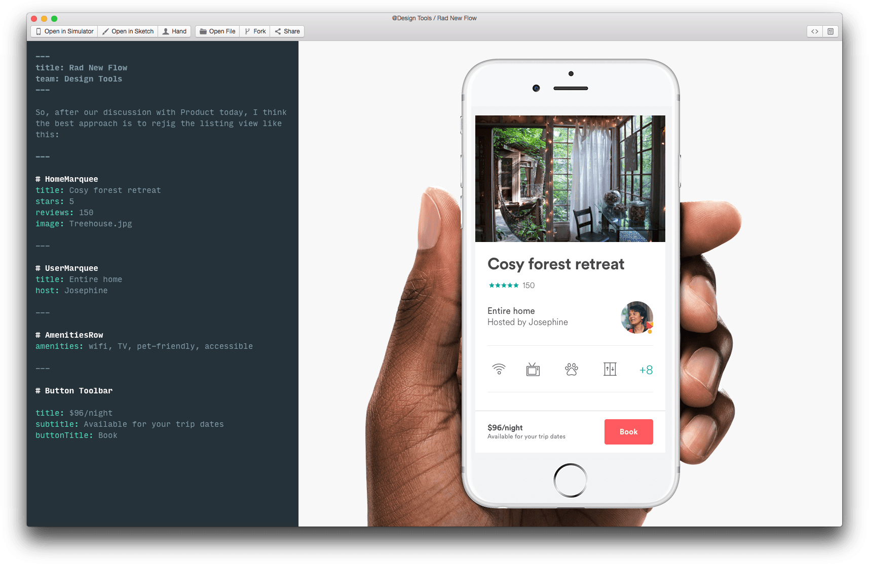
Literate DLS was my hackathon project from February 2017, exploring the intersection of literate programming, notebook-based tools (e.g. Jupyter), and symbolic design systems.

I keep coming back to this quickest, dumbest of prototypes as a compelling example of why we don’t need to drag rectangles to design products — it’s far quicker than using Sketch, and outputs cross-platform applications with the click of a button.


